In my previous blogs I rapidly analyzed the 2020-21 intra-Québec migration data, using straightfoward techniques. In this blog I look at the same numbers, using GEPHI network analysis software. In doing so I provide a series of pictures that illustrate these migration patterns: I hope you find them as fascinating as I do!
As a quick aside, GEPHI is open-source software. It is a little clunky – i.e. not absolutely straightforward to use – but the basics can be picked up in a few hours.
The nodes
The key principle of network analysis is that two types of element are analysed: nodes (i.e. points between which connections are measured) and edges (connections between the nodes).
Network analysis can be used to analyse huge graphs, with multiple interconnections between many nodes. In this case, though, I am merely using it to illustrate migration flows between Québec’s seventeen regions.
The nodes are illustrated below. They are roughly set out in spatial relation to each other, but spacing is increased between regions close to Montreal to make the figures legible.
The edges
This is where things become difficult. How can one represent migration flows between regions? If raw numbers are used, Montreal simply dominates because of its sheer size. If we try to relativise migration flows, what do we relativise them against?
Another issue is that flows are bi-directional: there are TWO links between each region, one from region A to B, the other from region B to A.
I have chosen two relative measures of migration.
First, I measure migration flows as a percentage of the population of the *receiving* region. This indicates what impact inward flows have on the regions at the end of the direction arrow.
Second, I measure migration flows as a percentage of the population of the *sending* region. This indicates what impact outward flows have on regions sending people.
In each case, I only illustrare flows that correspond to at least 0.25% of the receiving (case 1) or sending (case 2) region – i.e. I ignore tiny flows.
For example:
Imagine a flow of 340 people from Gaspésie to Montréal (this is the actual 2020-21 flow). This represents 0.53% of Gaspésie’s population: it is a significant outflow. However, it only represents 0.03% of Montréal’s population: it is an insignificant inflow.
Conversely, imagine a flow of 538 people from the Capitale-Nationale (Québec City) to Côte-Nord: it is an insignificant outflow from Capitale-Nationale, since it only represents 0.07% of its population. Conversely, it is a significant inflow to Côte-Nord, since it represents 0.59% of its population.
Key to the figures
In the figures below:
- in figures with all flows, the darker the green, the higher the actual number of migrants. This is a very rough indicator of the raw number of migrants.
- in figures that focus on Montreal, blue indicates out-going flows (from Montreal), and red indicates incoming flows (to Montreal).
- the thickness of the connection (as well as the size of the arrowhead) indicate the % of the receiving region’s (first set of figures) or the sending region’s (second set of figures) population that is migrating.
- the arrowhead indicates the direction of the flow (always towards the receiving region and away from the sending region)
Flows into receiving regions
The thickness of each arrow measures flow as a percentage of the receiving region’s population: thus, it is an estimation of impact upon the receiving region.
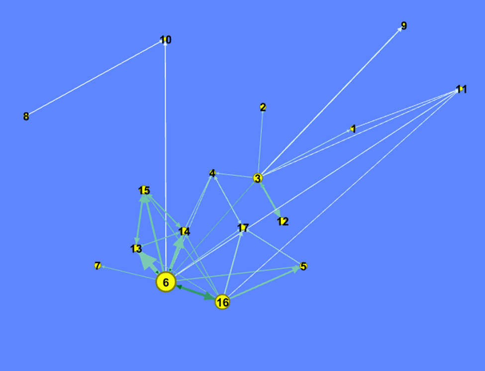

It can be seen that outlying regions – particularly Gaspésie, but also Bas-St-Laurent, and Côte-Nord – are receiving significant inflows from more regions in 2020-21 than they were in 2014-15. The pattern of flows around Montreal has not greatly changed, though Montreal is sending out significant flows (for the receivers) to a higher number of regions.
Flows out of sending regions
The thickness of each arrow measures the flow as a percentage of the sending region’s population: thus, it is an estimation of impact upon the sending region.

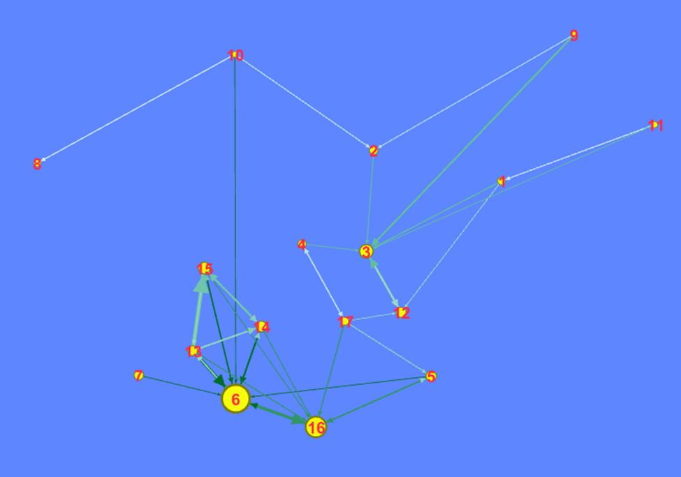
Montréal remains the focus of significant flows out of most regions in Québec, COVID notwithstanding. However, Abitibi-Témiscamingue and Gaspésie, two of Québec’s most peripheral regions, are no longer, in 2020-21, losing significantly to Montréal. Likewise, Québec City and Mauricie are no longer losing signficantly to Montréal. Thus, whilst Montréal remains the key place towards which regional populations are moving, its attraction seems to have weakened somewhat.
There are somewhat fewer significant outflows from regions such as Gaspésie, Côte-Nord, Abitibi and Mauricie.
Inward flows: focus on Montréal
Flows into and out of Montreal are expressed as % of the receiving region’s population: this measures the impact on the receiving region.

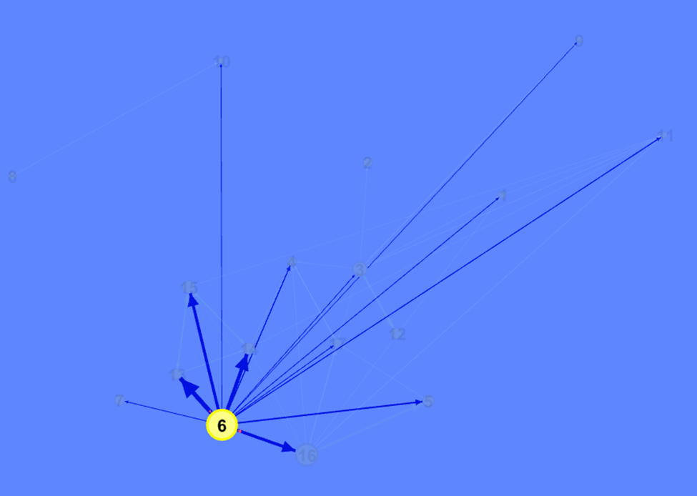
In 2014-15 Montreal received significant inward flows from Montérégie, Laval and Lanaudière (indicated by the very small red arrows). In 2020-21 this remains true for Montérégie and Laval. The key difference between these two maps is that far more regions benefitted from significant increases in their population (i.e. over 0.25%) due to migration out of Montréal in 2020-21 than did in 2014-15.
Outward flows: focus on Montréal
Flows into and out of Montreal are expressed as % of the sending region’s population: this measures the impact on the sending region.


The number of regions losing significant proportions of their population to Montréal is far lower in 2020-21 than it was in 2014-15: there are now far fewer arrows (each representing at least 0.25% of the sending region’s population) pointing towards Montréal. The same four regions (Laval, Montérégie, Laurentides, Lanaudière) received significant proportions of Montréal’s population over both periods. However, the flow from Montréal into Montérégie is visibly larger in 2020-21, and the flows out of these four regions into Montréal are visibly smaller.
Conclusion
These figures do not greatly add to the analysis presented here, here and – in English – here. However, they allow us to visualise the flows, to get an idea of their spatial extent and, by applying an (arbitrary) cut-off of 0.25%, to distinguish significant from non-significant flows. They allow a story to be told that is not as evident when continuous numbers are examined.
As pointed out in my previous blogs, the changes observed in migration patterns between the immediate pre-COVID period and now are not that extreme. However, changes have been afoot since about 2014-15: by comparing that period with 2020-21, the nature of some longer-term changes becomes more apparent.

One thought on “(Illustrated) changes in Québec’s migration patterns”